Tuesday, 3 May 2016
Monday, 18 April 2016
Saturday, 16 April 2016
Evaluation: In what ways does your media product use, develop or challenge forms and conventions of real media products?
By Sarah Dick
By Sarah Dick
By Hannah Wood
Evaluation: In what ways does your media product use, develop or challenge forms and conventions of real media products?
By Sarah Dick By Sarah Dick By Hannah Wood By Hannah Wood By Hannah Wood By Sarah Dick
Friday, 15 April 2016
DigiPak Development
I was able to access a DigiPak PDF file that I used in photoshop to ensure that the measuerments were correct.
I started off with the middle cover and cropped a photograph of Aidan to the size of the frame.
To maintain the style throughout both of our DigiPaks, we used a range of squares onto of pictures of on the border to create a minimalist style that brings the style of my digipak and poster together.
For the back cover, I used an out of focus image of New York skyline that focused upon the black gates. I emphasised the colours in the background using the hue/saturation tool on P
Photoshop.
Again, I added a square around to create a border, reducing the opacity of the black square to 40%.
A photo of the empire state that I had already edited on afterlight, I added to the city disk as it is a cliché shot of New York and adds some colour to the CD disk.
For the front cover, I decided to use a close up of Aidan, to focus purely on him as the album is his.
I then created a border by adding two layers, one being plain black and the other squares and then merged together and removed the squares to see the image underneath. I decided that the plain black was too prominent and took away from the actual image, so I reduced the opacity down so you could see Aidan underneath slight.
To incorporate the Idea of New York and Newcastle, I used two photographs, one of the buildings in New York and one of the Tyne Bridge in Newcastle and reduced the opacity down over the squares.
I then added the name of the album/artist on to of Aidan in a white bold font as it contrasts the background and the other colours used in the images.
The final image of my digi pak.
Development of Music Poster
I decided upon this photograph as it allows me to place writing above Aidan and have the wall as a place for information about the album. I used the font, Caudex, for the name of the artist.
I then used the font Baskerville for the title of the album as it is similar to the name of the artist, but slightly different. I also picked colours for the title from Aidan's clothing.
I decided to change the colour of the font from a darker colour, to a light colour so it stands out from the background. I also added a bordered around using two squares and removing the centre to then reduce to opacity to 40%. This links both Digipak and music poster together.
I then added a rectangle, I also reduced the opacity down to 40%, in which I would add the popular songs from the album on.
I added the names of the tracks, also adding the website so people could go and buy the album.
I then created a record label logo and the hmv logo.
Music Video Progress
We decided to add some more footage of the university to show Aidan studying in Newcastle. So I was able to edit them in and upload the final take.
Responsibilties
As Hannah and I were working as a team when producing this, we were able to split the filming and editing into two sections. Hannah was in charge of filming the clips and I was responsible for editing. We both had input into what the shots would look like and finalised together.
Music Poster Draft
To ensure that our music posters fit together, I changed the name of the album to a self titled album. I have also decided to move the logos down to the bottom section of the poster as I think it takes away the information from the top section. I also need to add a release date for the album.
Thursday, 14 April 2016
Music Poster Flat Plan
I also decided to change the music poster design and have one full portrait photograph of Aidan, instead of splitting it into sections. Having the photographs that I took got Aidan in the bottom and centre of the photograph, I can use the top section to display information about the artist and album.
Digipak Flat Plan
For the front cover, I plan to create a window effect, creating four squares to show an image of Aidan through the centre. The name of the artist shall be displayed over the image.
For the back cover, I plan to use a photograph of New York skyline and then add a black square with the opacity reduced and then add the track listing of the album. I shall also add a barcode, information about the band for contact reasons and logos for the record company.
Digi Pak Development
I have decided to change the images used for the front cover of my digi pak. Instead of having multiple images, I have decided to use the Kings of Leon album cover that we analysed and have Aidan's face split into squares.
Monday, 11 April 2016
Saturday, 9 April 2016
Photographs
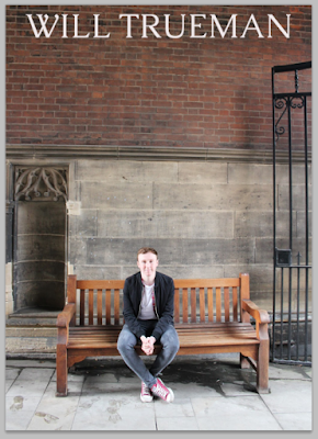
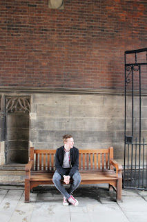
When we out filming, I was able to take some more photographs of Aidan for my digipak and music poster.
Subscribe to:
Comments (Atom)


