
I was able to access a DigiPak PDF file that I used in photoshop to ensure that the measuerments were correct.

I started off with the middle cover and cropped a photograph of Aidan to the size of the frame.

To maintain the style throughout both of our DigiPaks, we used a range of squares onto of pictures of on the border to create a minimalist style that brings the style of my digipak and poster together.

For the back cover, I used an out of focus image of New York skyline that focused upon the black gates. I emphasised the colours in the background using the hue/saturation tool on P
Photoshop.

Again, I added a square around to create a border, reducing the opacity of the black square to 40%.

A photo of the empire state that I had already edited on afterlight, I added to the city disk as it is a cliché shot of New York and adds some colour to the CD disk.

For the front cover, I decided to use a close up of Aidan, to focus purely on him as the album is his.

I then created a border by adding two layers, one being plain black and the other squares and then merged together and removed the squares to see the image underneath. I decided that the plain black was too prominent and took away from the actual image, so I reduced the opacity down so you could see Aidan underneath slight.

To incorporate the Idea of New York and Newcastle, I used two photographs, one of the buildings in New York and one of the Tyne Bridge in Newcastle and reduced the opacity down over the squares.
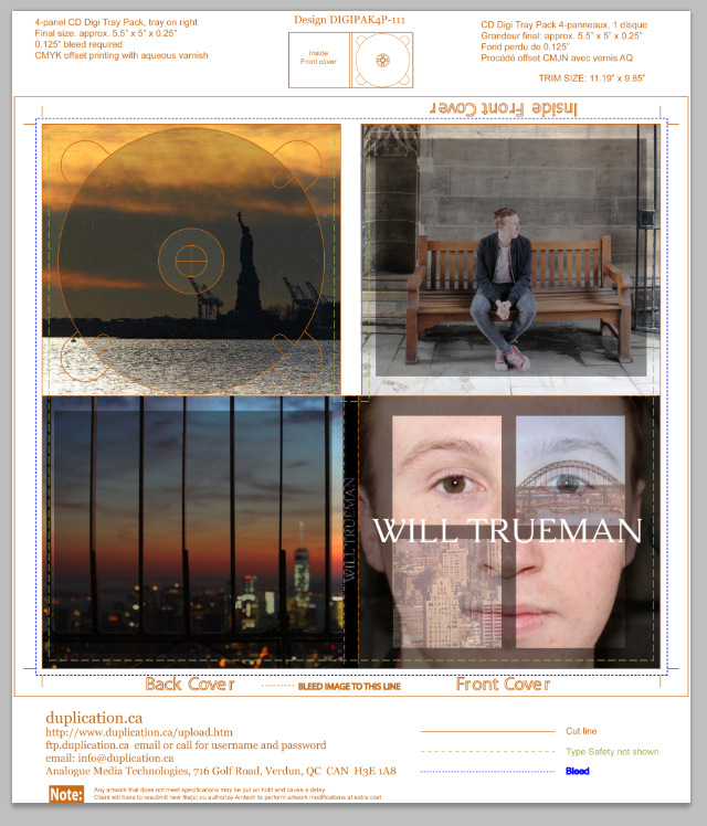
I then added the name of the album/artist on to of Aidan in a white bold font as it contrasts the background and the other colours used in the images.

The final image of my digi pak.
No comments:
Post a Comment